Box Model: Understanding the Foundation of CSS Layout

Cascading Style Sheets (CSS) is the cornerstone of modern web design, allowing developers to control the layout and presentation of web pages. At the heart of CSS layout is the box model, a fundamental concept that governs how elements are sized and spaced on a webpage.
Understanding the box model is crucial for web developers and designers as it forms the basis for creating responsive and visually appealing web designs.
The Box Model Fundamentals
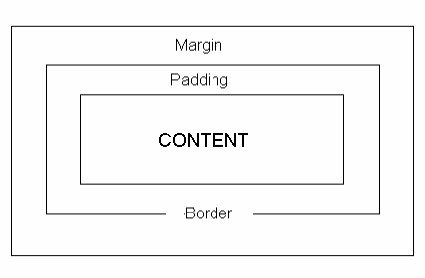
The box model represents how every HTML element is treated as a rectangular box in CSS. This box has four essential components:
Content: This is the actual content of the HTML element, such as text, images, or other media.
Padding: Padding is the space between the content and the element's border. It creates an inner boundary within the element. Padding can be set independently for each side (top, right, bottom, left) or as a single shorthand property.
Border: The border is a line that surrounds the padding and content of an element. It defines the outer edge of the element. Like padding, borders can be customized for each side or specified as a single property.
Margin: Margin is the space outside the element, creating a gap between adjacent elements. Margins can also be set individually for each side or using a shorthand property.
Here's a visual representation of the box model:
Now, let's explore each of these components in more detail.
Content
The content area represents the core information contained within an HTML element. For elements like text, images, or videos, the content area is intuitive.
However, for block-level elements like <div> or <p>, the content area may expand to fill the available width by default. You can control the width and height of the content area using CSS properties like width and height.
Padding
Padding adds space between the content area and the element's border. It helps control the element's internal spacing and ensures that the content isn't too close to the border.
Padding can be set individually for each side (top, right, bottom, left) using properties like padding-top, padding-right, padding-bottom, and padding-left. Alternatively, you can use the shorthand property padding to set all four sides at once, like padding: 10px;.
Border
The border defines the outer edge of an element and separates it from adjacent elements. Borders can have different styles, widths, and colors.
You can customize the border properties using border-style, border-width, and border-color, or use the shorthand border property to set them all together. For example:
border: 2px solid #333;
This sets a 2-pixel wide solid border with a color of #333.
Margin
Margin creates space outside the element, affecting its positioning in relation to other elements. Margins can be set for individual sides or as a shorthand property. For example:
margin-top: 10px;
margin-right: 20px;
margin-bottom: 10px;
margin-left: 20px;
Or the shorthand:
margin: 10px 20px;
Margins also play a crucial role in centering elements horizontally or vertically within their parent container.
Calculating Total Dimensions
To calculate the total dimensions of an element (i.e., its width and height), you need to account for the content, padding, border, and margin. Here's the formula for calculating the total width of an element:
Total Width = width + padding-left + padding-right + border-left-width + border-right-width + margin-left + margin-right
And for total height:
Total Height = height + padding-top + padding-bottom + border-top-width + border-bottom-width + margin-top + margin-bottom
Keep in mind that these calculations are essential for ensuring that elements fit correctly within their containing elements and maintain proper spacing.
The Box Model in Action
Understanding the box model is critical when designing layouts and positioning elements on a webpage.
For example, when creating a grid layout with equal-sized columns, you need to account for padding, border, and margin to ensure that each column lines up correctly.
Additionally, when applying CSS box-sizing property, you can control how an element's dimensions are calculated.
The two main values for this property are content-box (the default) and border-box. With content-box, the width and height properties only apply to the content area, while with border-box, they include the padding and border.
This can simplify layout calculations and prevent unexpected element resizing.
.box {
  width: 200px;
  height: 100px;
  padding: 20px;
  border: 2px solid #333;
  margin: 10px;
  box-sizing: border-box;
}
Conclusion
The box model is a fundamental concept in CSS that governs how HTML elements are sized and spaced on a webpage. By understanding the content, padding, border, and margin, web developers and designers can create responsive and visually appealing layouts.
Accurate calculations of an element's total dimensions are essential for precise control over web page design and layout. As you continue to develop your CSS skills, mastering the box model is a crucial step toward creating beautifully styled web pages.


